Stop grading rebrands in 48 hours
McLaren, Galway, Spotify and Tate McRae were judged in a weekend. The ones that look like disasters often age fine.
New brand identities are judged too fast. In the first 48 hours people mostly react to unfamiliarity, so the old logo always wins. Rebrands like Airbnb's Bélo and Instagram's 2016 icon were mocked and aged fine, while Meta's tidy 2021 rebrand fronted a costly bet. Judge legibility on day two, and the rest after a year.
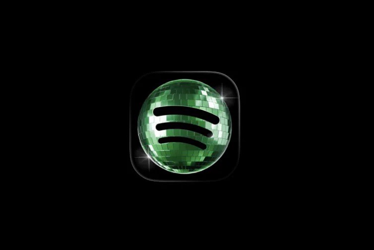
It has been a busy autumn for the internet's brand review board. In September McLaren swapped its wordmark for one based on the sign above Bruce McLaren's old workshop, and it was soon being compared to a hotel loyalty program. Galway City Council replaced the capital "G" the city had used since 1984 with a lower-case one, and a campaign started to keep the old one. In October, designers were cringing at the ultra-light Helvetica on Tate McRae's "Housewife." And back in May, Spotify's anniversary disco-ball icon was only a few days old when the company posted, "Alright, we know glitter is not for everyone."
Every one of those verdicts was in before the work had been seen anywhere but a screenshot.
Here's my view. A new identity on launch day is a promise with nothing behind it yet, and the first 48 hours mostly measure how surprised we are. Judge the promise once it has had time to be kept or broken. Give it a year.
Day two measures surprise
People like what they've seen before. The old logo has years of goodwill behind it, and the new one has an afternoon. Of course the old one wins the first weekend. We're grading the gap in familiarity and calling it taste.
And a screenshot is the worst possible place to meet an identity. Nobody experiences McLaren as a wordmark on a white background. They meet it on a car, a race suit, a pit wall, usually moving very fast. Galway's "g" will live on bins, vans and signs for years. The only place none of these have been tested is the place they're being judged.
Disasters that aged fine
When Airbnb launched its Bélo symbol in 2014, the internet found genitalia in it within a day, and Erik Spiekermann pointed out a lookalike. Twelve years later it's still the logo, and nobody remembers the jokes. When Instagram dropped its little brown camera in 2016, the backlash was instant and loud. The gradient icon that replaced it is still on your phone.
Neither of those was obviously right on day two. They were right by year two, which is the only time it could be known.
And one that looked fine
Now the reverse. When Facebook became Meta in 2021, the identity passed the 48-hour test. A smooth blue loop, a sensible wordmark, a confident launch. It looked like a company that knew where it was going.
What it was a sign for was the metaverse. Meta's Reality Labs division lost about $19 billion in 2025 alone, and more than $80 billion since 2020. Graded on launch day, it was a tidy rebrand. Graded on what it promised, it's one of the most expensive identities ever made. Both verdicts looked at the same loop. Only one of them waited.
Meta was back in the dock this autumn, with a much smaller mark. In September it launched Muse, its AI agent, with a looping "M" refined by the lettering artist Jessica Hische. She announced the job on Threads already braced for it, saying people would be "mad because it's AI and Meta," and titled her newsletter "Don't Be Mad at Me." Plenty were. Many designers criticized her for taking the job at all, and she ended up explaining payrolls and an employee's health plan to strangers. Others spotted that the M looks a lot like Mural Arts Philadelphia's logo. Hische agreed there's a resemblance; Mural Arts said it wasn't concerned.
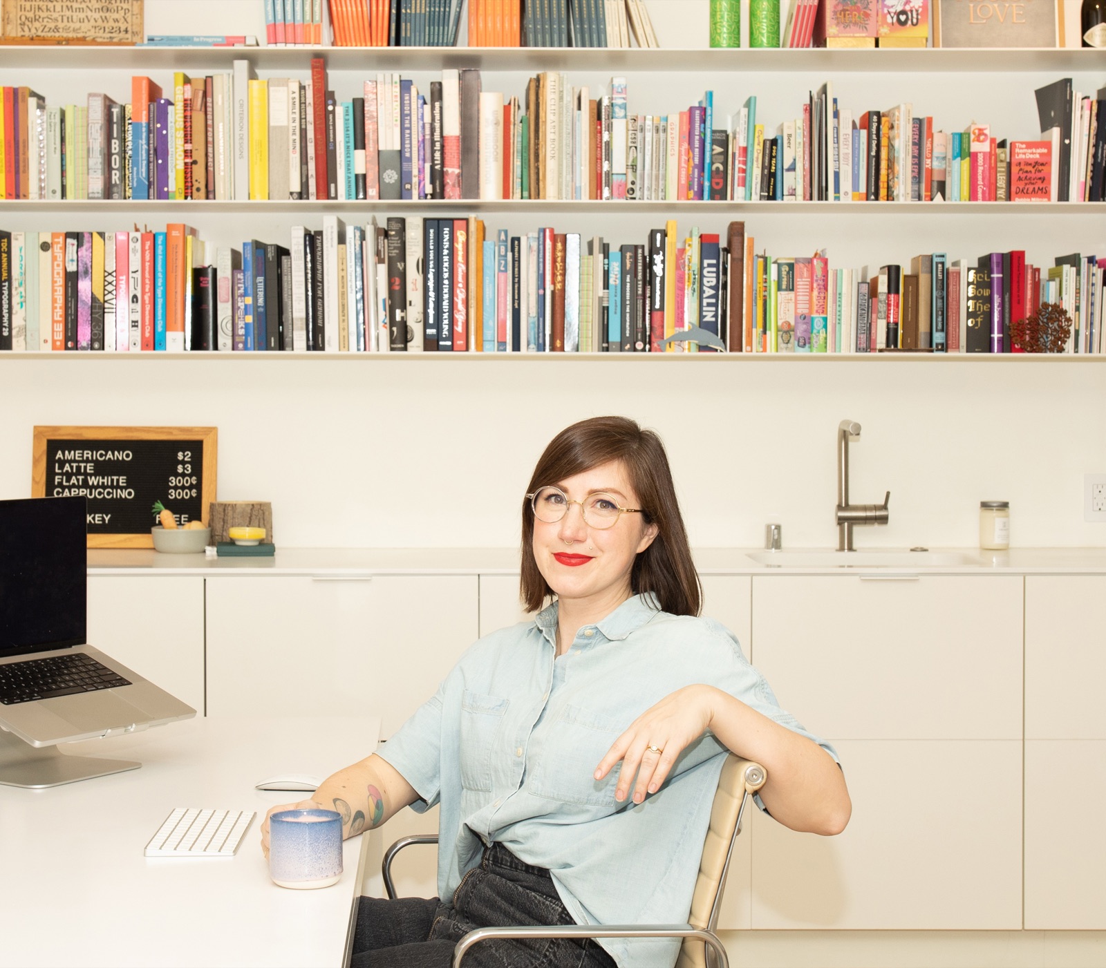
Very little of that weekend was about the M itself. The verdict was on the client and the technology, and on the designer for working with both. That may be a fair argument to have. It tells you nothing about whether the mark will hold up.
The case for speed
To be fair, sometimes the fast verdict is right. In early 2009 Tropicana replaced the orange with a straw on its carton with a generic glass of juice. Unit sales fell 20 percent in under two months and the old carton came back. Shoppers, it turned out, couldn't find it. That's a real signal.
But look at where it came from: shoppers in supermarket aisles, not quote posts. When Cracker Barrel dropped its new logo inside two weeks last year, it was answering the posts. Maybe the logo was bad. We'll never know, because it never got long enough to be anything other than new.
Some day-two criticism also deserves to land. If a logo is illegible at small sizes, or turns out to look almost exactly like another company's, that's worth saying straight away. That's a fact about the work. "I don't like it yet" is a fact about us.
What the weekend does to brands
Which leaves a bigger question than whether any one logo is good. What happens to brands when every launch gets a verdict by Monday?
Spotify promised to pull its disco ball within days. Cracker Barrel folded in two. If backing down is the fastest way to end a news cycle, does anyone hold their nerve long enough for a new identity to bed in? And if they won't, do rebrands get safer every year, until they all start to look the same?
Then there's who the verdict is coming from. When analysts looked at the Spotify pile-on, they found that almost a quarter of the profiles taking part weren't real, and that one mocking joke made up 40 percent of the whole conversation. How much of a backlash is customers, and how much is the feed feeding itself?
There's also the uncomfortable flip side. One brand newsletter argued Spotify's ugly icon worked better than any campaign it had run in years, because everyone was suddenly talking about Spotify. If outrage is attention, and attention is the job, is a rebrand that gets roasted a failure at all? Is anyone now designing for the roast?
And the one I keep coming back to: if an identity is judged on the weekend, as a screenshot, does it start being designed for the weekend, as a screenshot? McLaren will live on cars for decades. Galway's "g" will be on bins for twenty years. Tate McRae's type will last a single cycle. They're getting graded on the same timeline.
I don't know where that lands. But it's worth noticing that the weekend verdict has never been less informed, and never been louder.
Sources
- McLaren's new wordmark and the reaction: Design Compass and Autonocion, September 2026
- Galway City Council's "g": The Irish Times, RTÉ and Connacht Tribune, 2026
- Tate McRae's "Housewife" cover: Creative Bloq, October 2026
- Spotify's 20th-anniversary icon: Yahoo, May 2026
- Airbnb's Bélo and the reaction: Dezeen, 2014
- Instagram's 2016 icon: VOA, 2016
- Jessica Hische and Meta's Muse logo: The Dieline, September 2026
- Muse and Mural Arts Philadelphia: The Philadelphia Inquirer, September 2026
- Meta Reality Labs losses: Storyboard18 and Outlook Respawn, 2026
- Tropicana's 2009 carton: Ad Age, 2009
- Spotify backlash and inauthentic profiles: Cyabra, 2026
- Spotify's icon as attention: State of Brand, 2026
- Cracker Barrel's 2025 logo: KWTX, 2025
Written by Steve Salgado