Make the deck. Make it beautiful.
The deck gets mocked as busywork, but it is where an idea gets shaped, tested and made to count.
Making the deck is where an idea gets shaped, not a chore for the end. Start it early, once a few ideas feel right, and use it to test whether the story holds. Build it like a picture book, one clear thought per page, make it beautiful, and make sure it works when someone opens it alone.
Every creative industry has its deck jokes. Death by PowerPoint. "Can you just make it look nice?" The forty-slide credentials section nobody asked for. Somewhere along the way, making the deck became the job you hand to whoever's newest, the chore that happens after the real work.
I think that gets it almost exactly backwards. The deck is where an idea gets shaped, where the hard calls get made, and where the thinking either holds together or falls apart. It deserves as much care as the work it carries.
A slideshow that won an Oscar
An Oscar-winning documentary started life as a deck. Before An Inconvenient Truth was a film, Al Gore had given his climate slideshow more than 1,000 times, by his own estimate, changing it a little after every room.
Nobody made a movie out of the first version. They made it out of the thousandth, the one that had been worn smooth by every audience that got lost, lost interest or leaned in. By the time it reached the screen, the story had already done its work in the deck. The film just gave it a bigger room.
Where the story actually starts
On a big idea, a campaign or a brand, I go all in on discovery first. Moodboards, immersion, everything the brief touches. Then, once I've planted a few flags I feel good about, I start the deck. Early, well before I know the answer.
That's the point. The deck forces my hand. Is this on idea? Is it on brand? Is it selling the capability, or the product? Every page has to earn its place next to the one before it, so any gap in the thinking shows up fast. I read it back as if I'm the client sitting in the room, hearing this pitch for the first time, then again, then again. If I keep getting lost at the same point, that's the idea telling me it isn't ready. We pivot there.
"Storytelling" is an overused word, and plenty of people sell their own formula for it. Pick the one that suits you. The test I use is whether the story feels like a conversation you could have with someone, where they walk away knowing where you started, where you went, and where you're going next.
It helps that I save decks. Ones I love, keynotes, pitches that landed, even a really well-built email someone sent me. They sit in a folder and come back when I need them. When I'm selling an integrated campaign, I'll remember a deck with the right shape, the same kind of bets in the same order, and borrow its structure as a starting framework. That's also an early pressure test. If the new idea won't sit in a flow that has worked before, it's worth asking why.
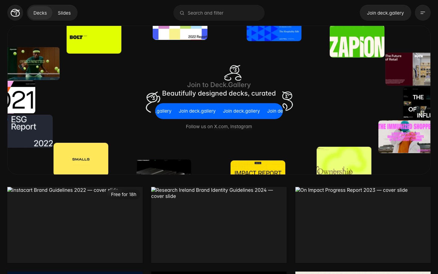
If you don't have a folder like that yet, Deck.Gallery is a good place to start one. It's a curated library of presentation design, with pitch decks, keynotes, reports and brand guidelines from companies like Instacart and Zapier, and a new deck added every day. The polish is nice, but the real value is seeing shapes: how a report opens, how a pitch gets from the problem to the ask.
Write it for the kid at the back
This is why I build decks a bit like a children's book. One clear thought per page. Pictures that do real work. A shape anyone can follow. Pixar storyboard artist Emma Coats shared a version of that shape in her 22 rules of storytelling in 2011: once upon a time there was something. Every day, this happened. One day, something changed. Because of that, this, and because of that, this, until finally. It's a bedtime story, and it's also a very good pitch.
Story is half of it. The other half is plain instruction. Can someone follow it step by step without you there? Think of the last IKEA flat-pack you built, staring at a wordless drawing of a tiny man and a dowel, wondering how page six got from there to a finished Kallax. I'd feel real pain handing someone a deck like that, knowing it was the best I could do at explaining how the thing goes together.
It also helps to be a little dumb about the subject. When I'm not the expert, I can't hide behind jargon, so I end up building something the least informed person in the room can follow. Oddly, that's usually the version the experts like best as well.
Beautiful, because it counts
I'm not a sketch-on-a-napkin person. The deck should be as beautiful as the idea and as the work, because it's the piece sitting between the two. It's like a movie: people are finally seated, the lights are down, and they're listening to what you have to say. It has to count.
So it gets proper communication design: whitespace, a clear hierarchy, pages that breathe and are easy to take in at a glance. A lot of designers and agencies treat deck design as beneath them. I think that's how good ideas get lost between the meeting and the approval.
It also has to survive without you. I love a minimal, theatrical presentation with one word on a slide, but the reality now is that someone opens the link three weeks later, alone, and forwards it to their boss. A deck that carries the story on its own will beat one that only works with you standing next to it.
The AI reality
To be fair, the skeptics have a point. A beautiful deck can sell a bad idea, and plenty have. A bad deck can also leave a good idea out to pasture. Polish is a form of persuasion, and persuasion without substance is exactly what gave decks their reputation. AI makes that easier than ever.
Every tool that makes decks now wants to make them for you. Gamma, the AI presentation startup, raised money at a $2.1 billion valuation last November. In June, Google started rolling out Gemini in Slides to build a full presentation from a single prompt, and in May OpenAI put ChatGPT inside PowerPoint to create and edit slides without leaving the app. In a minute you get something with a title slide, a clean layout and confident headlines.
The trouble is that looking finished was never the hard part. Researchers at Stanford and BetterUp Labs have a name for this: "workslop," AI-generated work that looks good but doesn't move anything forward. In their survey, 41% of US workers had received some in the past month, and each one took nearly two hours to deal with. A generated deck is the perfect workslop delivery system: it's polished enough that nobody questions it until the meeting, when it turns out to be about nothing.
I use these tools, and they're handy for a first shape, a quick structure or a layout pass. But a deck that writes itself skips the part where you find out if the idea holds. You never get lost on page seven, so you never learn why. Keep pressure testing it. Read it as the client, and make sure you're not just talking to yourself.
Make the deck
So make the deck, and make it early. Start it once you have a few flags planted, borrow the shape of one you've saved, and use it to find out whether the idea holds. Read it as the client, as the new starter, as the person who opens the link cold. Cut whatever confuses them. Then make it beautiful, because the deck is where the idea lives or dies, long before it ever gets out of the boardroom.
Sources
- Gamma raises at $2.1B valuation: TechCrunch, November 2025
- Gemini generates full presentations in Google Slides: Google Workspace Updates, June 2026
- ChatGPT add-in for PowerPoint: WinBuzzer, May 2026
- "AI-Generated 'Workslop' Is Destroying Productivity," BetterUp Labs and Stanford Social Media Lab: Harvard Business Review, September 2025
- Al Gore and Davis Guggenheim, An Inconvenient Truth, 2006
- Emma Coats, Pixar's 22 rules of storytelling, 2011
Written by Steve Salgado