Type drawn by people who design identities for a living
Stockholm studio Gärde Design draws typefaces for brands, each one built on a specific piece of type history.
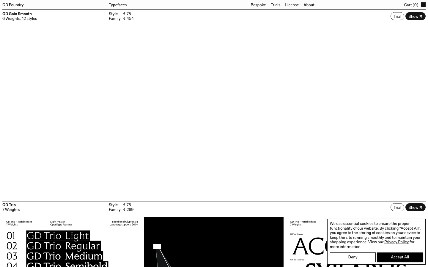
GD Foundry is the type foundry of Gärde Design, a branding studio in Stockholm. Each typeface builds on a historical reference, like GD Trio from the Trajan inscription and GD Bauer from 19th century serifs, plus GD Unio, a uniwidth UI font. It offers free trials, one license by company size and bespoke type.
Gärde Design is a boutique branding studio in Stockholm, and after twenty years of building identities around typography, it kept watching the same thing happen. The typeface would get cut from the budget. So the studio started drawing its own, and GD Foundry is the result.
That origin shows in the work. These are typefaces made by people who spend their days on identities, so they're drawn to carry a brand, not just fill a specimen page. And every one of them starts somewhere specific in history.
One foot in history
The foundry's rule is that each release has a lineage, a form shaped by time that it builds on or argues with. In practice, that makes the catalog unusually fun to read.
GD Trio, in the video at the top of this article, goes back to the Roman capitals carved into the base of Trajan's Column in 113 AD, the letters behind Adobe's Trajan in 1989. The team worked from studies of the original inscription and earlier Greek stonework, then added something the Romans never would: a Black weight. It was first drawn for the identity of NGLM, a group of design companies, and the case is on the site.
GD Bauer is a pointed display serif from a 19th century European tradition, with ink traps that show up at large sizes and a separate text version that keeps its character at body size. It's named after John Bauer, the Swedish illustrator of forests, trolls and silent princesses.
GD Grio looks at the moment when 19th century eccentricity met 20th century clarity. It keeps the uneven proportions and curious terminals, and it's built as a variable font, so it moves from text to expressive display.
GD Gaio goes the other way. It's a neo-grotesk that sets out to disappear, taking Beatrice Warde's idea that good typography is a crystal goblet. It's the studio's house typeface, with support for over 200 languages.
The one built for screens
GD Unio is the odd one out, and the one most web and product designers will want. It's uniwidth, so every character takes the same horizontal space in every weight. Switch a label from Regular to Bold and nothing moves. Buttons keep their size on hover, links don't shove their neighbors when they go active, and tabs stay put through every state. If you've ever fought a navigation bar that jitters on hover, you'll get it straight away.
What else is there
The rest of the catalog includes Gaio Smooth, Albio, Optio, Octio and Serio, many with display and text cuts. Trial fonts are free, single styles start at €75 and families run from about €114 to €474. One license covers desktop, web and app, priced by company size.
The studio also draws bespoke typefaces for brands, from first sketch to final weight, and offers a Brand License that lets a client rename a font so it appears as their own. They also invite requests: if there's a historical face you wish someone would bring back, tell them. They say that's usually where their next typeface starts.
Heads up
It's a young, focused catalog, and most of it leans toward display and identity work. If you need a big workhorse family with dozens of weights and non-Latin scripts, a larger foundry is a better bet.
The history is a big part of the appeal, but check the actual letterforms in the trials before you fall for the story. Some of the display cuts are very particular and won't suit every brand.
Who it's for
Identity designers who want type with a real reference behind it, and a good story for the client presentation. Product and web designers who have ever wished bold text didn't reflow. Anyone who enjoys reading how a typeface came to be as much as using it.
Start with GD Unio if you work on screens and GD Trio if you work on brands, and download the trials for both.
Written by Steve Salgado
About GD Foundry
- Made by
- Gärde Design, Stockholm
- Typefaces
- GD Trio, GD Bauer, GD Grio, GD Gaio, GD Unio and more
- Known for
- Typefaces rooted in historical references
- Price
- From €75 per style, one license by company size
- Extras
- Free trials, bespoke type, Brand License
- Best for
- Brand identities and UI
You might also like
Typewolf is how you stop using the same three fonts
[ Read ↗ ]